For this study, after appending and merging the model results get a file by monthly simulation. We created and analyzed two datasets. The first dataset encompasses historical data spanning 31 years, while the second dataset contains results projecting 30 years into the future.
Dataset 1: Historical Period (1983-2013) (refer to Table 2)
Dataset 2: Future Period (2070-2099) (refer to Table 3)
We modeled AET for each of the 8,677 mesh nodes distributed across the NSRB. This modeling was performed for both the historical and future periods, resulting in a total of 3,227,844 rows for the former and 3,123,720 rows for the latter.
Table 2. Dataset 1: Historical Period (1983-2013)
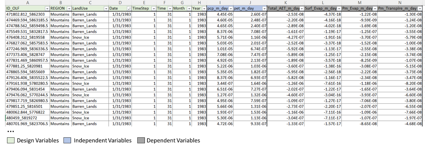
Table 3. Dataset 2: Future Period (2070-2099)
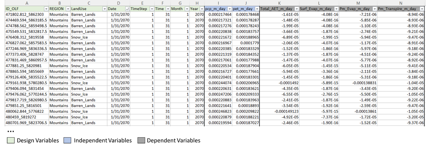
Our datasets include eight design variables that describe the location of each node through an ID composed of X and Y coordinates separated by an underscore ("ID_OLF"). Additionally, we have nominal variables, "REGION" and "LandUse," which indicate the location of each node, along with continuous variables describing the modeled date (“Date,” “TimeStep,” “Time,” “Month,” “Year”).
Within our datasets, we've incorporated two continuous independent variables: monthly mean precipitation in meters per day (“pcp_m/day”) and monthly mean PET in meters per day (“pet_m/day”).
Furthermore, we've integrated four continuous dependent variables into our datasets. These include the total AET modeled in meters per day (“Total_AET_m_day”), signifying the cumulative ET from both the surface and porous media domains. Additionally, we have surface evaporation (“Surf_Evap_m_day”) from the surface domain, as well as evaporation and transpiration from the porous media (“Pm_Evap_m_day” and “Pm_Transpire_m_day,” respectively).
Data Exploration
In this section, the graphs display the raw data. Initially, I transform the units from m/day to mm/month, which are more commonly used in literature. Then, I illustrated the trend in monthly precipitation over the years for my Historical Period (Figure 7) and Future Period (Figure 8) in the three different regions of the NSRB: Mountains, Foothills, and Plains. By revealing the pattern and magnitude of fluctuations across these three regions, it becomes evident that the Plains region receives less precipitation in both periods. Additionally, it shows a change in the magnitude of precipitation peaks between May and August.
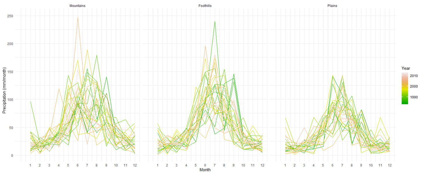
Figure 7. Historical Monthly precipitation for Mountains, Foothills and Plain in NSRB.
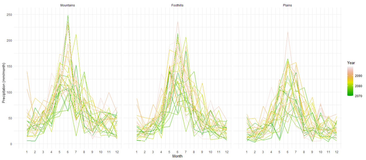
Figure 8. Future Monthly precipitation for Mountains, Foothills and Plains in NSRB.
To reveal the patterns in another independent variable, PET, which represents the demand for water by the atmosphere in this specific study area, similar line graphs were created, revealing similar peak values in July for both periods. However, there is an increase in the demand for water by the atmosphere from November to March. The region with the highest demand for water by the atmosphere is the Plains, followed by the Foothills and the Mountains, respectively (Figure 9 and 10).
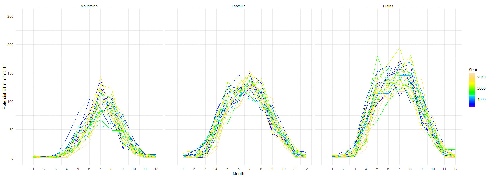
Figure 9. Historical Monthly PET for Mountains, Foothills and Plains in NSRB.
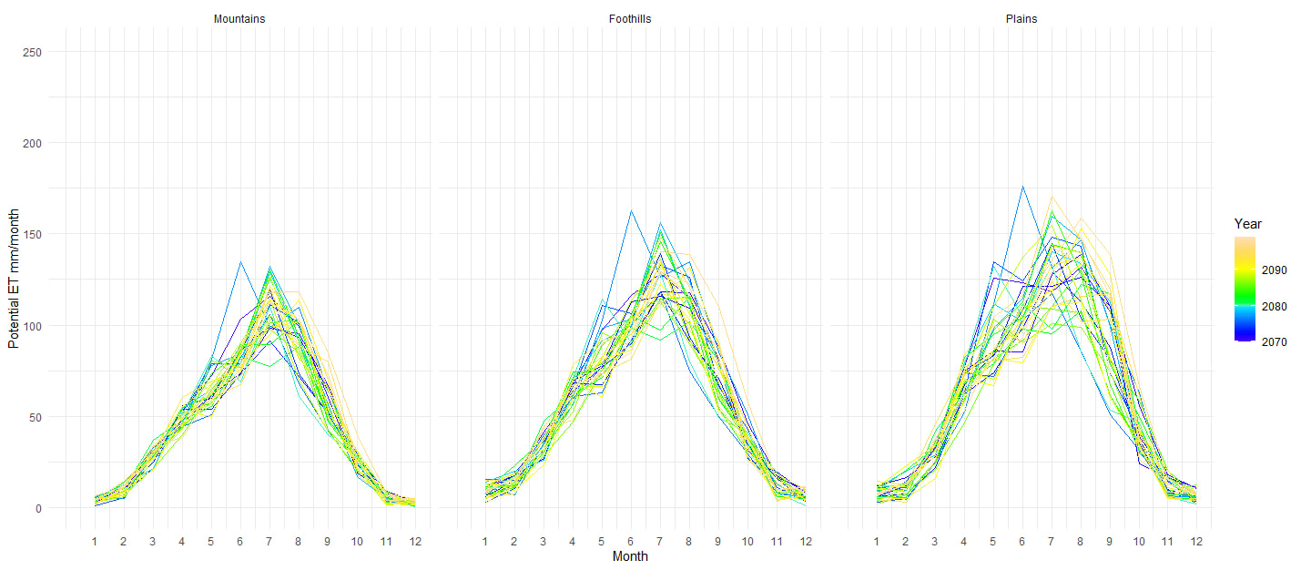
Figure 10. Future Monthly PET for Mountains, Foothills and Plains in NSRB.
To illustrate the distribution of my first response variable, Total AET, I created a set of boxplots, with one panel for each month. The y-axis represents the millimeters of water loss via ET, and the boxes are colored according to the regions. The notched boxplots display the distribution of Total AET within each month for the historical period (1983-2013) and future period (2070-2099) (see Figures 11 and 12, respectively). This allows for easy comparison of the data across different months and regions, revealing variations in the distributions and median values of Total AET per month and region.
It's worth noting that the foothills represent the area with the highest water loss, followed by the plains and mountains. Additionally, the trend identified in the PET graphs (Figure 9 and 10) is also evident, with an increase in median values from November to March in response to the atmosphere's demand for water.
It's worth noting that the foothills represent the area with the highest water loss, followed by the plains and mountains. Additionally, the trend identified in the PET graphs (Figure 9 and 10) is also evident, with an increase in median values from November to March in response to the atmosphere's demand for water.
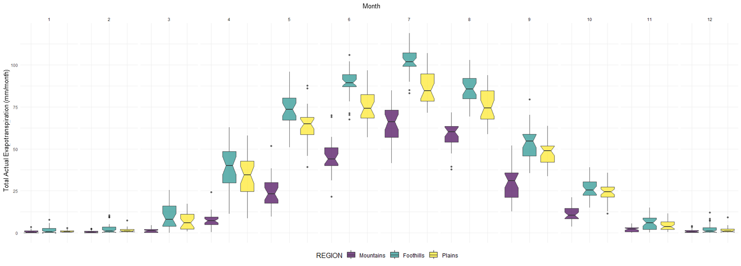
Figure 11. Historical Monthly Distribution of Total AET for Mountains, Foothills, and Plains in the NSRB.
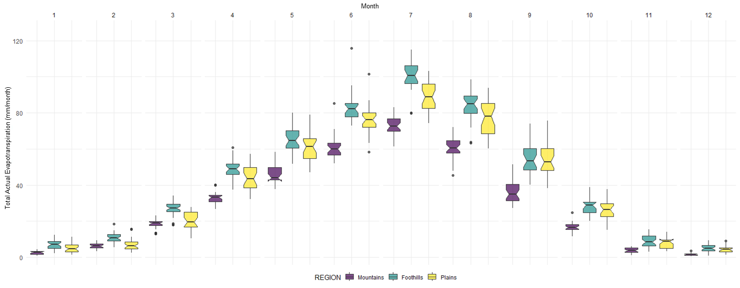
Figure 12. Future Monthly Distribution of Total AET for Mountains, Foothills, and Plains in the NSRB.
In addition, to understand the contributions of surface and porous media to AET, we created multi-line time series plots. Each line represents a year, and each color represents different sources of total AET over the modeled period, including surface evaporation, porous media evaporation, and porous media transpiration, for mountain, foothill, and plain regions (refer to Figures 13 and 14). These plots allow us to observe that transpiration from porous media, representing water uptake by plants, is the largest component of water loss. In contrast, surface evaporation accounts for the smallest amount of water loss. This pattern remains consistent for future periods, with some variations in distribution.
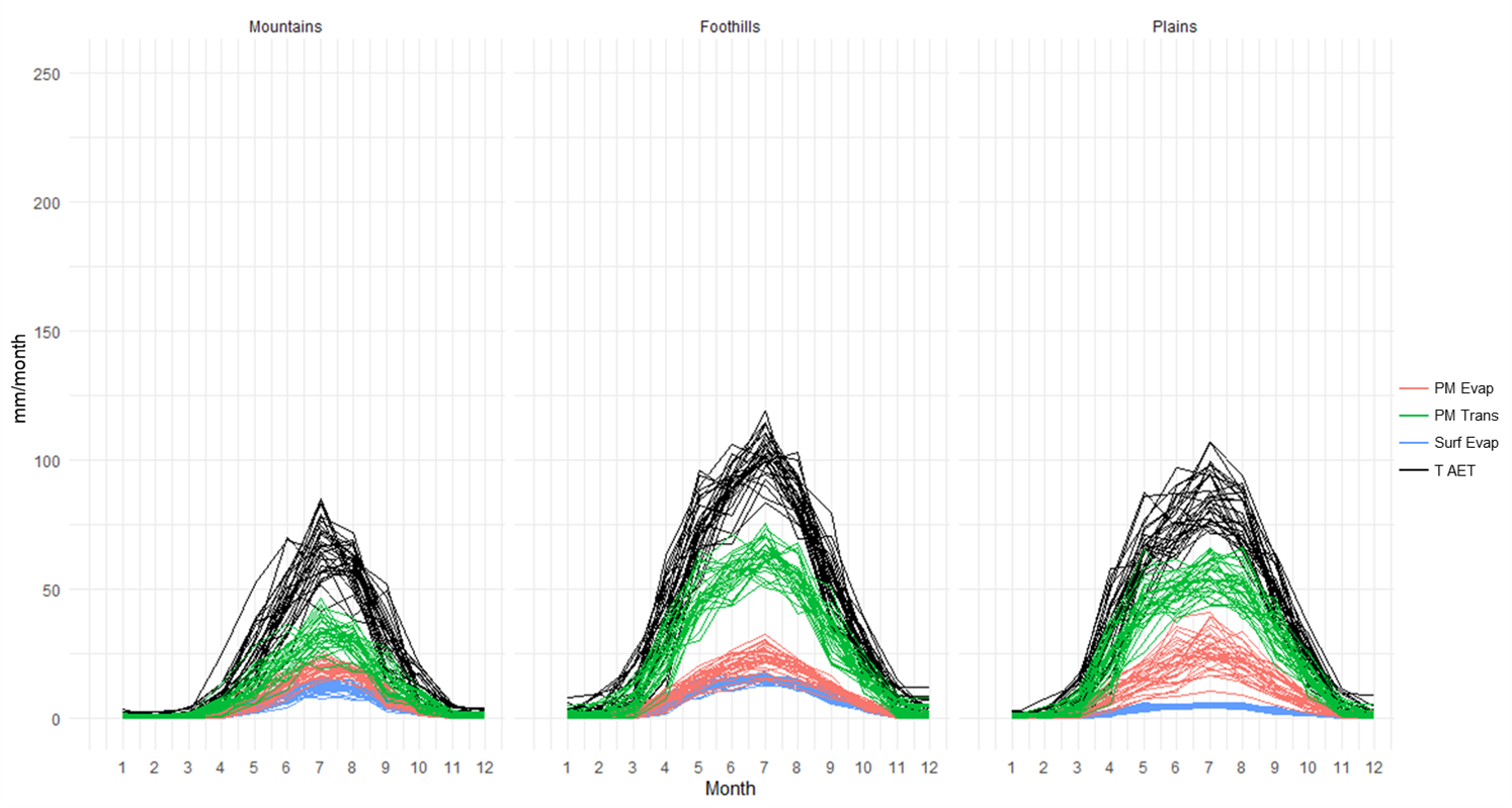
Figure 13. Historical Monthly of Total AET (black lines), Surface evaporation (blue lines), Porous Media Evaporation (red lines), and Porous Media Transpiration (green lines) for Mountains, Foothills, and Plains in the NSRB.
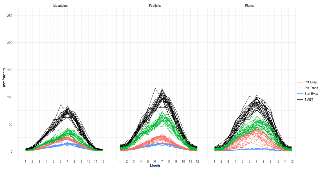
Figure 14. Future Monthly of Total AET (black lines), Surface evaporation (blue lines), Porous Media Evaporation (red lines), and Porous Media Transpiration (green lines) for Mountains, Foothills, and Plains in the NSRB.
Additionally, to illustrate the long-term trends, we created and plotted a subset of annual totals for precipitation, PET, and AET. These graphs show a consistent decrease in these variables over time for the historical period (Figure 15), while conversely, the trend points toward an increase for the future period (Figure 16).
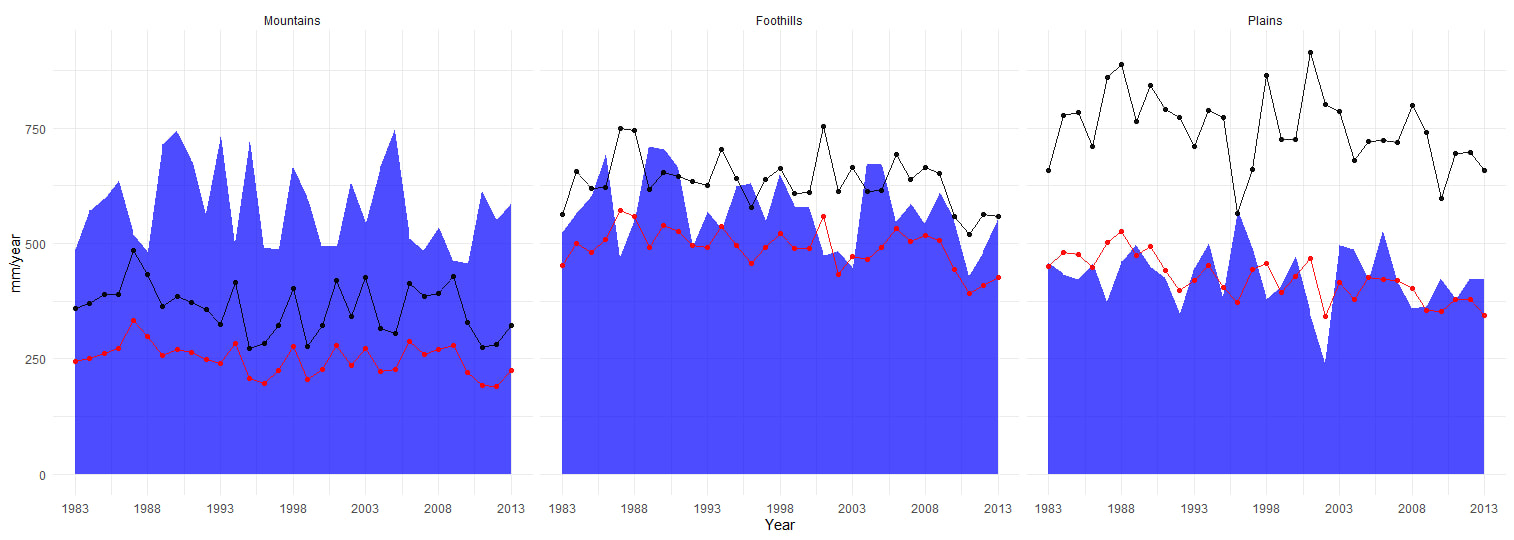
Figure 15. Historical Yearly AET (red line), PET (black line), Precipitation (blue area) for Mountains, Foothills, and Plains in the NSRB.
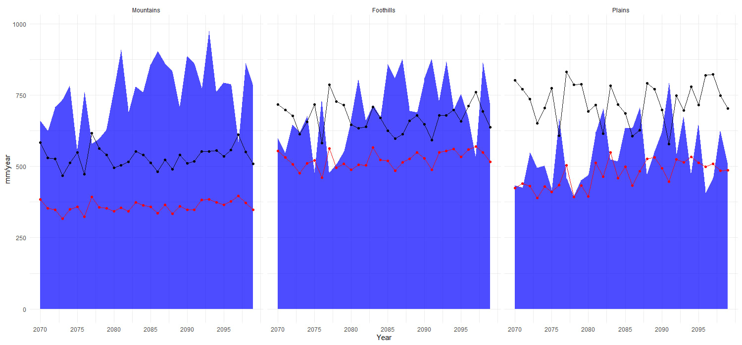
Figure 16. Future Yearly AET (red line), PET (black line), Precipitation (blue area) for Mountains, Foothills, and Plains in the NSRB.
Having a better understanding of the region and using the subset of the annual totals we proceed to create a combined plot provide a concise overview of ET across land use types and regions in the NSRB. It visually summarizes the distributions of total AET, surface evaporation, porous media evaporation, and porous media transpiration.
This combined visualization provides insights into how the same land use in different regions can evapotranspirate different rates. For instance, the croplands areas in the watershed, in plains this land use area transpirate more than in other regions but in foothills more water is loss via evaporation from Surface and Porous media than in other regions during the historical period (Figure 17). This pattern changes during the future period (Figure 18).
This combined visualization provides insights into how the same land use in different regions can evapotranspirate different rates. For instance, the croplands areas in the watershed, in plains this land use area transpirate more than in other regions but in foothills more water is loss via evaporation from Surface and Porous media than in other regions during the historical period (Figure 17). This pattern changes during the future period (Figure 18).
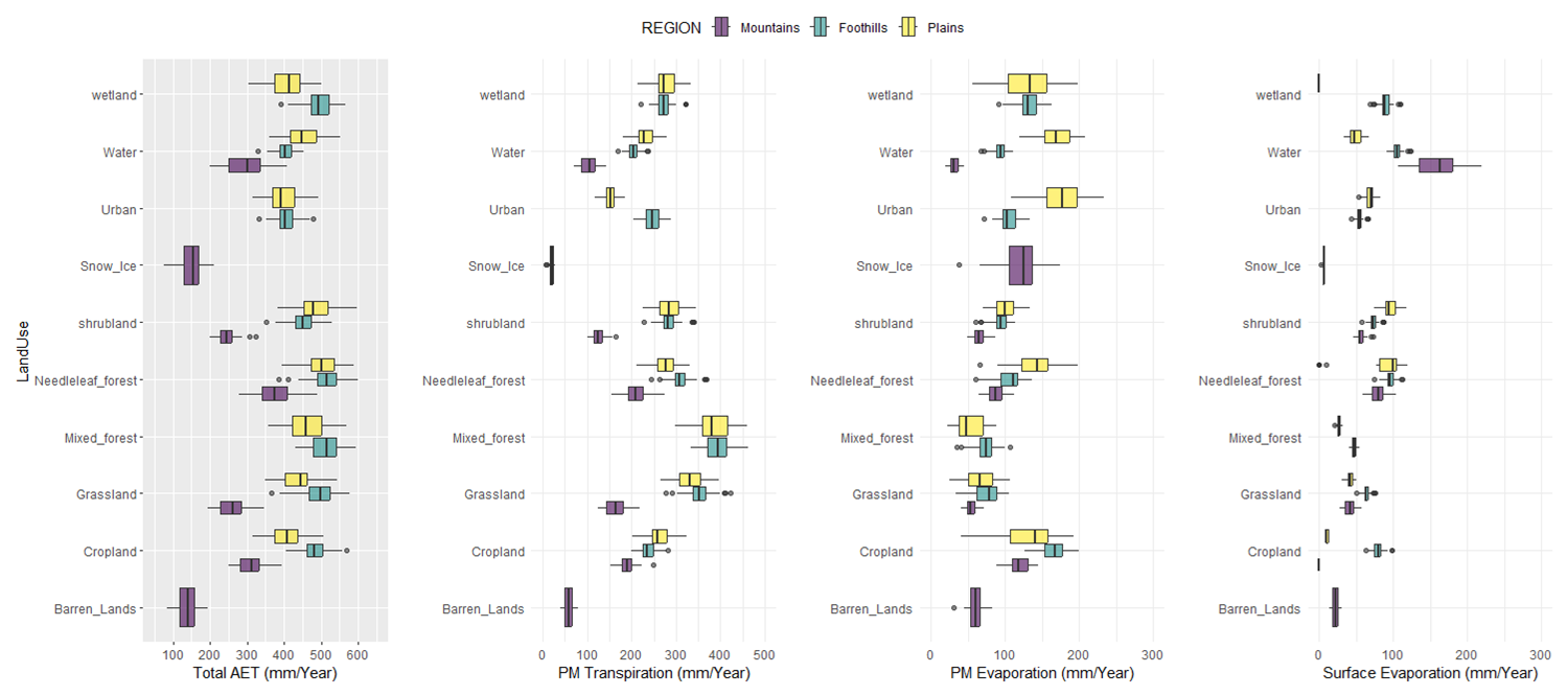
Figure 17. Historical Yearly distribution of total AET, Porous Media transpiration, Porous media Evaporation and Surface Evaporation for land use in the Mountains, Foothills, and Plains of the NSRB.
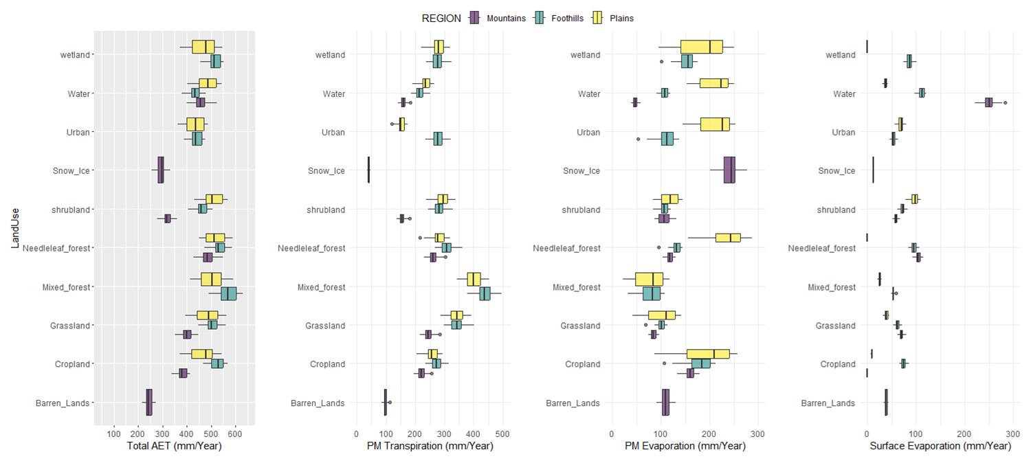
Figure 18. Future Yearly distribution of total AET, Porous Media transpiration, Porous media Evaporation and Surface Evaporation for land use in the Mountains, Foothills, and Plains of the NSRB.
